

Much like scope creep in learning design or project management, brands quickly lose clarity without defined frameworks. The purpose of this guide is to intentionally document the Rachel Mozingo brand, ensuring consistency across platforms over time.
These brand guidelines establish the visual and structural foundations of the brand, translating values into practical design decisions that support clarity, accessibility and longevity.
Branding Guide
About the Brand
The Rachel Mozingo brand is rooted in continuous personal, professional and creative growth. Throughout my career, I intentionally push myself to learn new skills, refine my approach, and evolve while staying grounded in clarity and purpose.
This brand reflects that progression: thoughtful development over time guided by structure and curiosity.
Brand History
The original logo, centered on a light bulb and brain motif, represented curiosity and ideation. At the time, this visual language aligned with an exploratory phase of my professional development.
While the symbol clearly communicated ideas and learning, it relied heavily on metaphor and illustration. As my work matured, I wanted a brand that emphasizes structure, execution and long-term scalable impact.

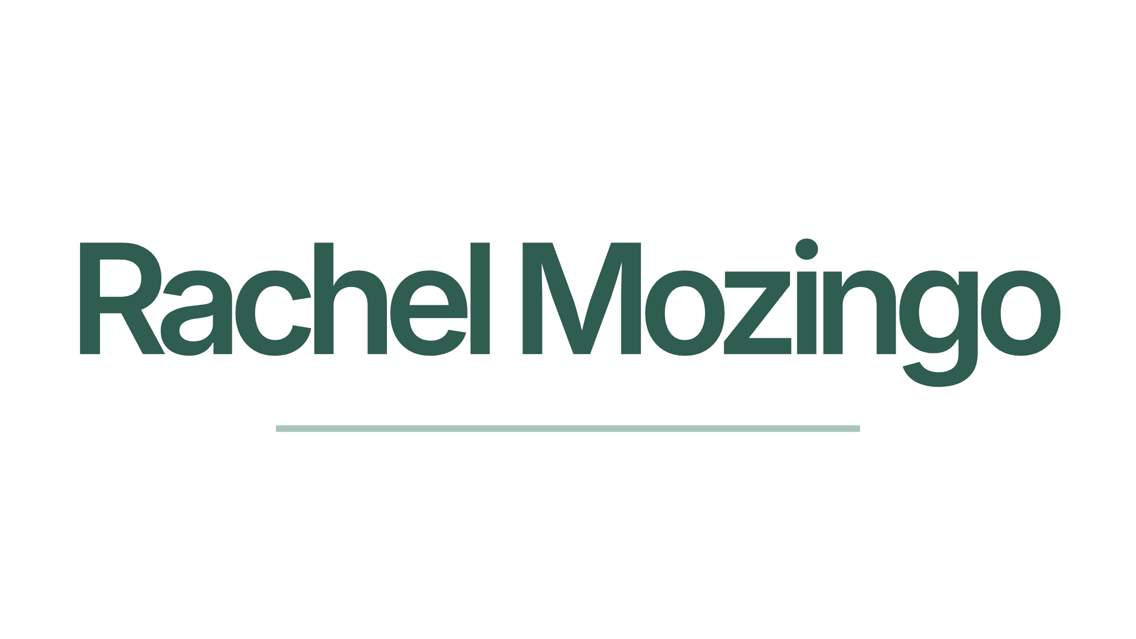
Logos
Primary Logo
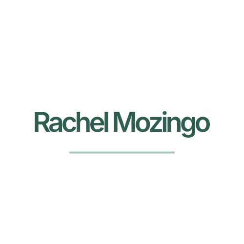
Secondary Logo
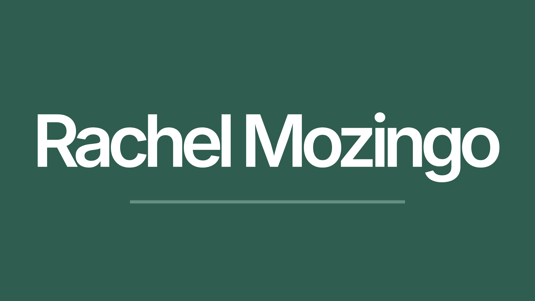
Favicon

Colors
The color palette reflects clarity, growth and long-term thinking. Rather than relying on high-contrast or trend-driven colors, the brand uses a restrained system that supports focus, reducing visual noise.
Grounded anchors the brand, representing steady growth, longevity, and thoughtful decision-making. It conveys confidence without urgency and provides a stable foundation across digital and print environments.
Evergreen supports the system by introducing softness and balance. It guides attention, reinforces hierarchy, and creates a sense of ease, which is useful for dense learning content.
The neutral palette Anchor, Balance, and Calm prioritize readability and space. These colors are intentionally understated, allowing content, data and learning outcomes to take precedence over decoration. Together, the palette creates a visual environment that feels calm and accessible for sustainability and growth.
Primary
Grounded
#2f5d50
47 / 93/ 80
50 / 0 / 14 / 64
Evergreen
#7fa79a
127 / 167/ 154
24 / 0 / 8 / 35
Secondary and Neutral
Steward
#4faf8a
79 / 175 / 138
55 / 0 / 21 / 31
Rooted
#d6c4b0
214 / 196 / 176
0 / 8 / 18 / 16
Anchor
#1f2933
31 / 41 / 51
39 / 20 / 0 / 80
Balance
#6b7280
107 / 114 / 128
16 / 11 / 0 / 50
Calm
#ffffff
255 / 255 / 255
0 / 0 / 0 / 0
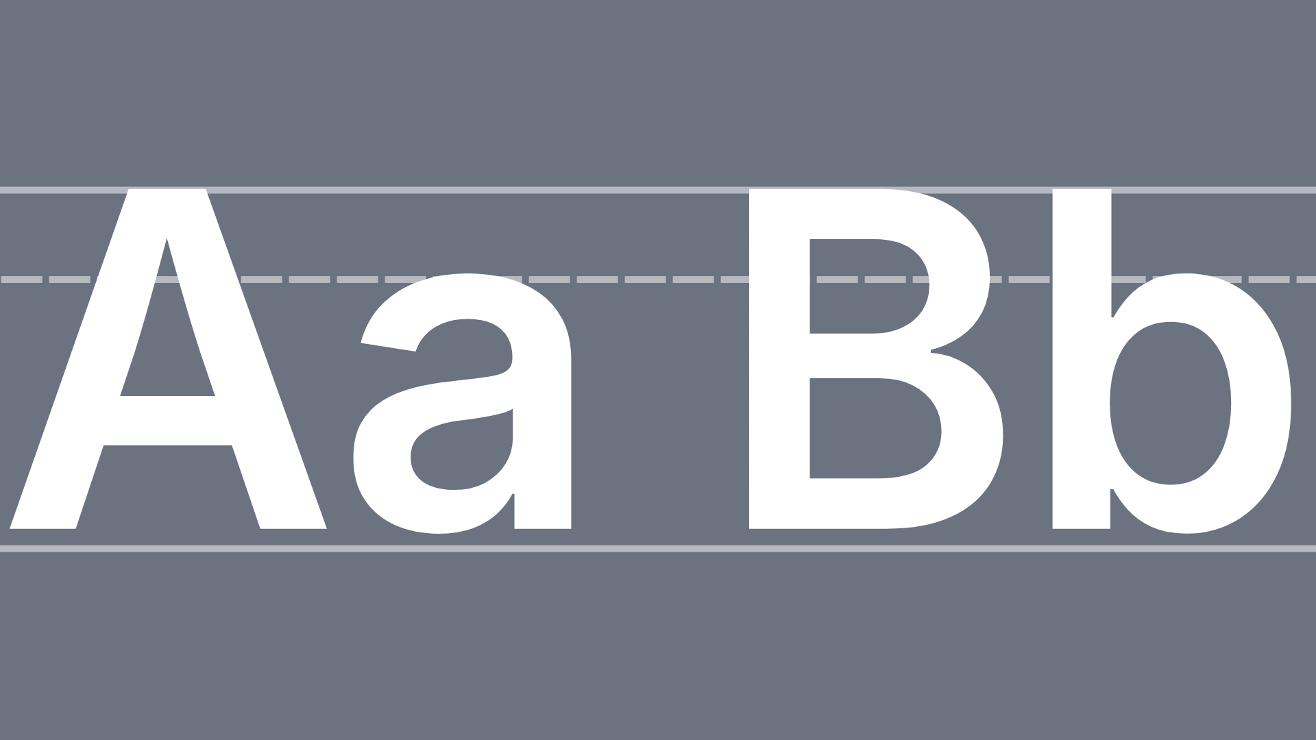
WCAG AAA Accessibility
Aa
Aa
14 pts. or greater
18 pts. or greater
14 pts. or greater
14 pts. or greater
Aa
Aa
Aa
14 pts. or greater
Typography
Typography plays a central role in how the brand communicates clarity and structure. The typeface Inter was chosen for its high legibility, modern simplicity, and strong performance across screens and print.
Designed specifically for digital environments, Inter supports accessibility and readability, making it well-suited for learning materials, project documentation, and data-driven content.
A single type family is used throughout the system to maintain consistency and reduce cognitive load. Variations in weight, rather than font, establish hierarchy and reinforce a clear, structured reading experience that aligns with usability and intention.

Clear
|
Confident
|
Human
|
Clear | Confident | Human |